Archive | General RSS feed for this section

Room by Room: Parlor Bathroom. Which mirror? Lighting? Tin ceiling? You decide.

16 Dec

Although it will be the smallest room in the house, the parlor bathroom is likely to be one of the more visible rooms to our guests, so it is important that we do her up right. We’ve decided to go for a period look that we think will tie the old in with the new, and we’d love your help, dear readers, with two elements: the mirror and the lighting!

Here’s a rudimentary elevation drawing to show you what the space will look like:
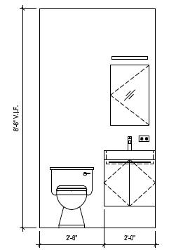
Basic elevation. Sink will actually be a pedestal and the mirror and sconce are still up for debate!

Petite but functional.

So, the floors throughout the house will be 5 inch wide Character Grade American Walnut floors supplied by Premium Floors right here in Brooklyn with a natural, tung oil finish. Here’s an ooh and ah photo for natural finish walnut floors:

Character Grade Natural Finish American Walnut.

Character Grade Natural Finish American Walnut.

We love the look of the sleeker “select” grade walnut, but with 2 kids and the softer nature of walnut, choosing character grade means the floor will start out with some imperfections and will thus be less noticeable when dings inevitably happen.

The flooring will extend into the bathroom.

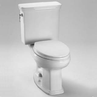
Here are the toilet and sink we’ll use in the space:

Toto Promenade Toilet.

Toto Promenade Sink.

We got a great deal over Black Friday weekend on Toto toilets and a bathtub for the kids bathroom from HomeClick.com.  We ended up with the Promenade model because of the 24 inch width. Most of the other Toto pedestals were 27 inches wide and 24 inches was our comfortable limit in this tighter space.

Faucets and accessories will come from Jaclo, the Roaring 20′s series:

Jaclo Roaring 20′s 8″ widespread faucet.

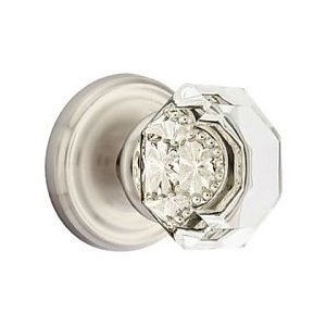
Doorknob from Emtek:

Emtek Old Town Clear Crystal Door Knob. Ours will be in Polished Chrome to match the fixtures.

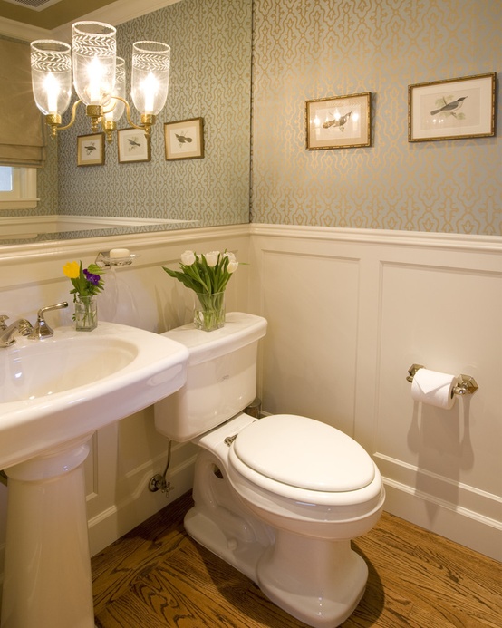
We were thinking of doing either a chair rail or wainscotting in this bathroom to complete the period look, but the “petite” size of the space will mean we need every inch. Therefore, I think a chair rail and nicely painted walls will finish the look nicely. Something like this:

Chair rail for powder room.

HELP US CHOOSE!

The final decisions in the bathroom are about lighting and mirrors: what kind? how big?  The mirror choice will define the lighting, so here are the contenders:

1. Full wall mirror: The room will be quite small (only about 5 feet by 4 feet) and will not have a window, so we thought it might open up the space to have a large mirror. The ceilings on this level are high though (even with the ceiling dropped to accommodate heating and other duct work, it will still be about 8 1/2 feet), so is too much mirror just too much?

Full wall mirror with some sort of embedded lighting. Too much mirror?

If we did that sort of mirror, lighting would probably be a recessed light plus an embedded sconce like this one:

Embedded sconces: sconces are mounted on the mirror itself.

Our sink is not that wide at only 24 inches, so one sconce may be all that we could fit.  The recessed light would help with additional wattage.

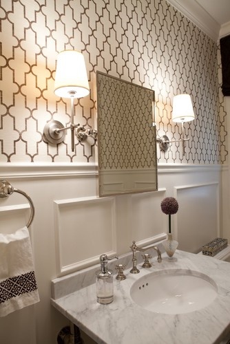
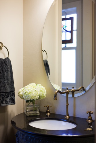
2. Tilting beveled wall mirror: I’m really drawn to the old-fashioned tilting wall mirror look.  I feel that it would work well in our bathroom in either a rectangular or oval shape. Our fear is constant fingerprints from guests compelled to moving it about. Should we worry?

Tilting mirror and small shade sconces.

The sconces would likely be similar, but again, we might only have room for one, given the dimensions of the bathroom.  Recessed light would also be an option.

3. Standard wall mirror: So with a standard mirror, options abound. We could do something simple like a beveled oval or rectangular mirror:

Beveled oval mirror.

Rectangular mirror.

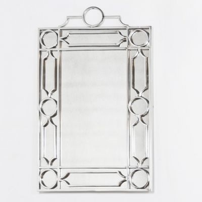
Or we could go with something with a little more graphic appeal like this one (chosen because it matches a backsplash we were and may still be considering):

Trelliage mirror.

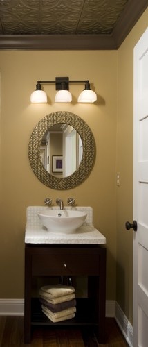
For the simpler, non-tilting, non-blingy wall mirror options, we might still go with a simple sconce but an alternative would be a schoolhouse style light like this one:

Schoolhouse pendant.

So, dear readers, that just about covers it. Full mirror, tilting mirror, standard mirror, or something with a little graphic interest? Sconces or pendant? And, one final question: tin ceiling or no tin ceiling?

Thanks in advance for your help! The comments about our kitchen lighting received online and off were so helpful…we’ll of course share all final photos as a big “reveal” at the end of the renovation.

Sorry Santa, the Chimneys are Gone

13 Dec

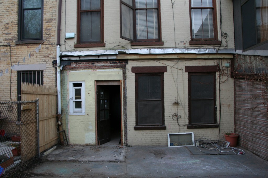
The house is just a little bit lighter this week with the removal of two chimneys and the shed.

New kitchen space.

We were glad the chimney removal occurred without issue given most of our planned kitchen layout depended on its removal. Now we can move forward with appliance purchases.

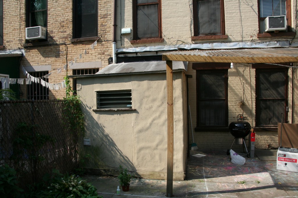
We were also pleased to see the shed come down without resistance. Here’s a before and after:

Before removal.

After shed removal.


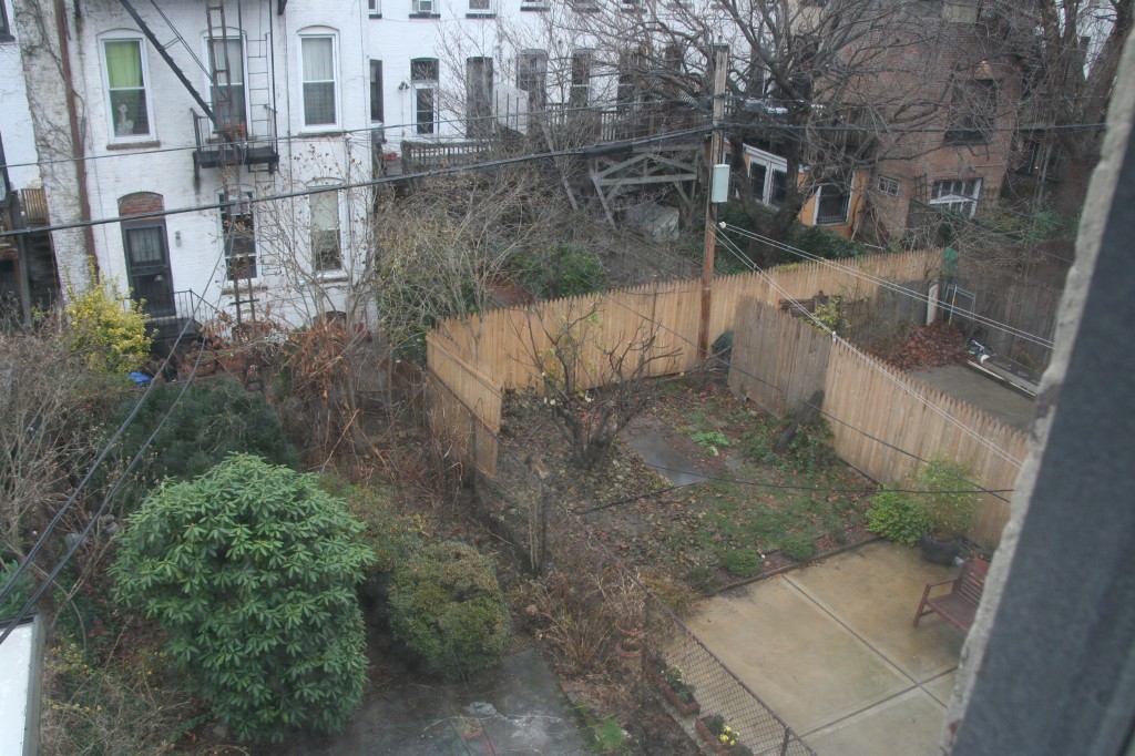
It is nice to take a walk around the backyard and feel so much space (for New York that is – 18.75′ wide anywhere else would be a side passage)! It won’t be long, though, before we put up a deck which will provide access to the backyard from the kitchen. In the meantime you can enjoy what inspired our deck choice.

Deck inspiration.
Our deck will look very similar (just flipped so the stairs come down on the right). Our kitchen window will also be showing our awesome faucet (see previous post).
Maybe the neighbors were getting a little jealous with all the debris being taken out. When I peeked out the back from our soon to be master, I noticed the fig tree next door received a bit of a trim. I guess this means we’ll have to lean a little further over the fence come the summer.

The fig tree gets cut.

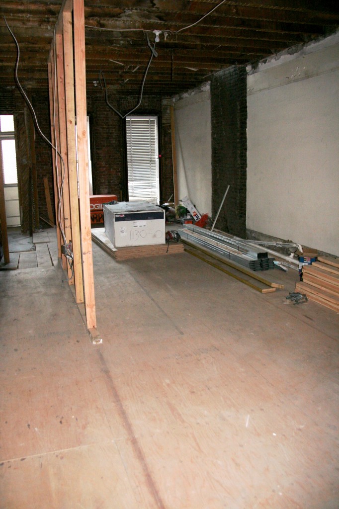
This week, the subfloor continues to go down and tracks are being laid down to show where the rooms are to be positioned.

Flooring continues to go down.

Tomorrow we are meeting with our architects and GC to discuss any changes and confirm the room sizes. We’ve had so many iterations of our floorplan it’s a little scary to think that things are about to be locked in but it does mean one steps closer to completion!


Room by room: Living Room

4 Dec

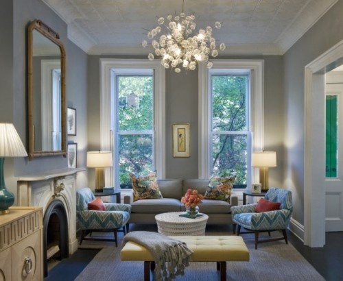
The living room will be an easy room to cover: for the time being, it will be a nice sitting space with a beautiful light fixture, our current furniture and not much else. You’ve definitely got to prioritize when it comes to doing an entire house all at the same time, and things like built-ins will simply have to wait.  More Black Friday sales luck, however, made the light fixture something we had to go for sooner rather than later. Here she is in all her glory:

Solaria bubbles chandelier

In fact, this photo of another Brooklyn brownstone served as great inspiration for our living room altogether. We too have a chimney in our space, though ours will be on the opposite wall. Ours also doesn’t have the lovely, period mantel that this one has, so it will be something we may try to find through Brownstoner or a Build it Green at a later date.  We’ll also try to find a great period mirror to complete the look.  The color is very pretty, too – for anyone who is interested, it is Benjamin Moore® Ben® Paint, Coventry Gray HC-169. We may, however, opt for something a little lighter and perhaps in a pale shade of blue, as our kitchen (the other major space on this floor) will feature gray prominently, but I’ve always been a big fan of gray, so you never know!

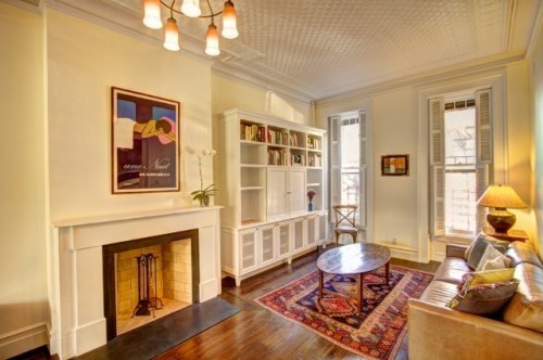
Our living room will have a similar opening, and our windows and ceiling height are all more or less the same, except everything will be reversed (our stairs and the entry to the parlor are on the other side).  Here is another inspiration photo:

Living room cabinet.

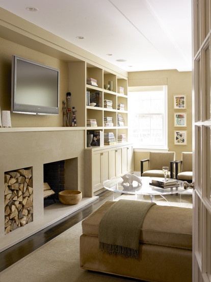
We had hoped to have the space for a separate tv area not in the main living space, but alas, space is always short and you have to compromise somewhere. We’re therefore going to eventually opt for some sort of built in in the living room to house the tv area, but this is probably an “after party” project (after the main renovation, that is).  The tv will be covered and the components area will have a similar grating to the photo above, but overall, we want a more built in look.  Our heating ductwork will go above this cabinet, so something more built in will keep things looking streamlined throughout. Here’s a final potential inspiration photo:


Built in for living room area. Ours will likely have grill work on the cabinet doors for easier component usage, some sort of doors to hide the television, and crown moulding to match the rest of the space.

Finally, the floors throughout the house will be supplied by Premium Wood Flooring, not far from us in Brooklyn. The old flooring was definitely difficult to part with as it was one of the few period details remaining in the house, but past renovations and changes to a two-family took its toll, and it would have been more expensive to restore the floors than to replace with some major compromises in terms of aesthetics and comfort (sound mainly).  The floors also required straightening from years of settling and were quite creaky in spots, which is easier to fix at the sub-floor level anyway.  It turns out that the old floor was actually very thin when it was pulled up, so it may not have survived the renovation, sanding and refinishing that would have been required.  Sorry to see you go, though, old floors.

The original parlor flooring. Very pretty, but thin, warped and super creaky. Still sad to see you go.

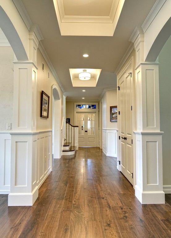
We’ll opt for a character grade, tung oil finished walnut throughout the house.  With any luck, the flooring in the living area (and throughout the house) will look something like this when we are all finished:

Character grade wide plank walnut with wood pegs and a natural finish.

Still considering 4 inch versus 5 inch wide plank.  Awaiting the final numbers! Thanks for reading.

As empty as she’ll get

2 Dec

Another week passes and we are starting to turn a corner. Instead of things continually leaving the house (plaster, debris etc.), things are now starting to move in. Granted, it’s just some wood to provide temporary flooring and support but it’s nice to see something new in the house.

1st floor


Everyone’s busy schedules seemed to align, allowing us to schedule a productive meeting between the architects, structural engineer and our GC. Nothing too serious came up while they worked through a couple of decisions on supporting the new back opening and the open kitchen plan. They all agreed that things in the house look pretty good overall and were please to see some extra big support beams existing and in good condition.

Future kid bedrooms and laundry.


Last weekend also saw some decent holiday sales which allowed us to save some money on some kitchen and bath items. We were most excited about a sale on a product that we’d just seen a few days earlier in a kitchen showroom. For a long time we were going with a nice Hansgrohe kitchen faucet but that quickly paled to an amazing faucet by Waterstone that we couldn’t stop talking about. It definitely was over budget for our faucet but the 20% discount we found softened the blow. We were also able to pick up a 10% discount on a number of Grohe items that we are using around the house, plus discounts on toilets, bathtubs and other bath accessories.  More on those in future room specific posts.

Gantry faucet


Next week we hope to wrap up removal and start laying down the subfloor and framing out the rooms. Once we’ve confirmed all the measurements, we’ll be able to pull the trigger on the biggest purchase of all: the appliances. More on those in another post.


Blue or Grey?

27 Nov

One benefit of having started our renovation later than expected is the bevy of Black Friday and Cyber Monday sales we were able to take advantage of as we start the shopping spree.  Faucets, shower bodies, tubs, toilets and accessories have all been ordered (details in a future post), and we’re finalizing many of the other selections. Next on the “big” list will be confirming our tile choices, which we’ll order once the room sizes are 100% confirmed and we’ve had a chance to review our tile choices with our architects.

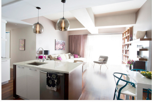
One item that couldn’t wait for a later date was our kitchen lighting.  I actually won a contest over the summer with one of our favorite lighting sources, Niche Modern, so we’ve decided to splurge and make their beautiful pendants the focal point in the kitchen.  A Black Friday sale is forcing our hand earlier rather than later, but we are still torn in terms of the color; this is where you, dear readers, come in!

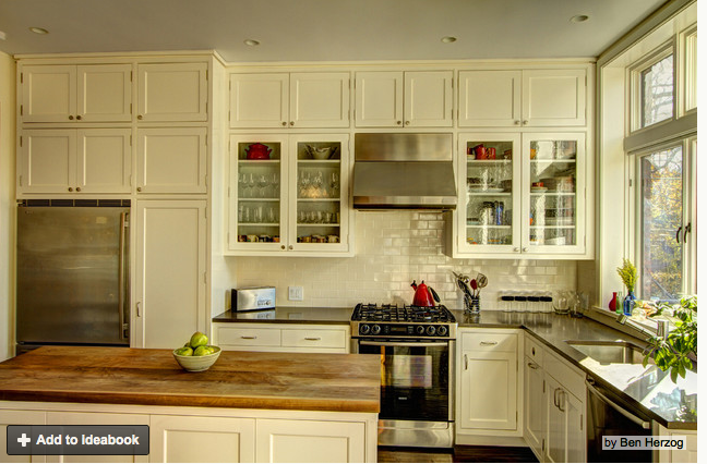
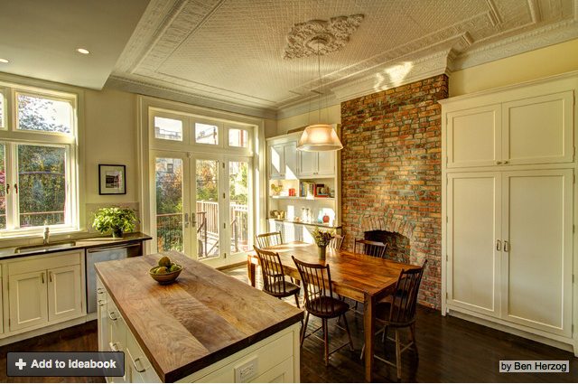
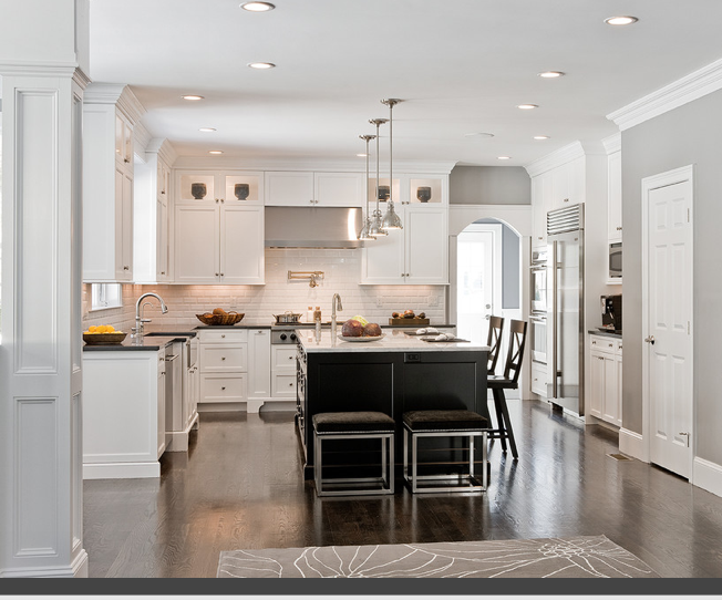
So, to give you an idea of what our kitchen will look like, here are the initial inspiration photos that very much replicate our layout and overall aesthetic:

Ben Herzog’s lovely inspirational kitchen.

Dining area view.

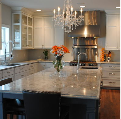
Our kitchen will have a similar layout, though our appliances will be larger overall, and our color scheme will be different.  We will have satin white, shaker cabinets, walnut floors, and grey granite countertops.  The color scheme will actually be quite similar to these two kitchens (without the dark island – our island will also be white):

White cabinets, grey counters, dark floors.

Another white cabinet, grey counter kitchen, this time with the fairly industrial hood and range combo we are going for as well.

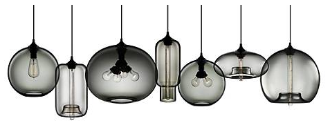
So, why all the preemptive background, and what does this all have to do with our post title, Blue or Grey? We’re deciding between the two for our lighting choices.  Here are the line ups on the Niche Modern website:

The Greys:

The Greys.

The Blues:

The Blues.

The Clears:

The Clears.

We will definitely be using two of the longer, bell shaped lights over the island, and one of the four pronged lights over the dining table. The only question is, in a kitchen with lots of white and grey already, do we go with the grey four pronged Terra over the dining table with clear bell-shaped lights over the island (they don’t make grey bell-shaped lights), or go for blue for all three?  Here are some grey and blue lights in similar color schemes:

The Blue light room:

The blue. Too specific? Too blue in a sunny room with white cabinets?

And the grey scheme:

The greys. Safe and sophisticated or boring and the easier choice?

Help! We welcome your thoughts.

Trucking along…

24 Nov

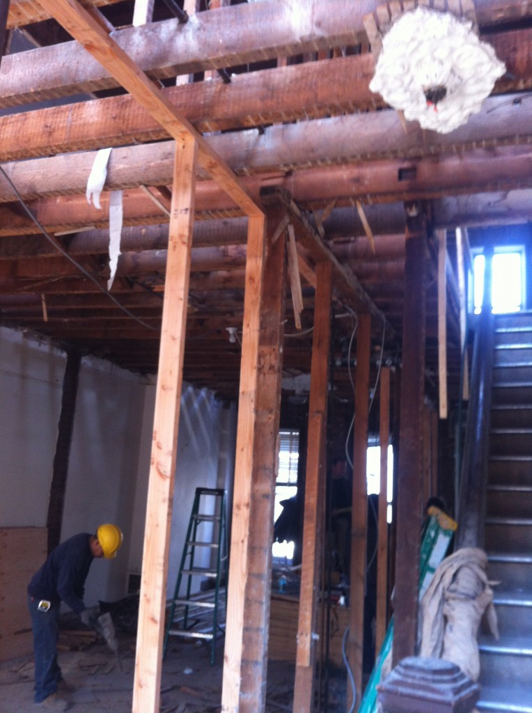
After our initial demo debris removal setback, things have been trucking along, literally and figuratively. What might have been two full container loads to haul mushroomed to 10-12 dump truckloads, but progress is progress! The basement level is nearly cleared out and ready for the work to begin, and the 1st floor is coming along. We haven’t braved the trek up to the 2nd floor as the house is of course very dusty, but we’re looking forward to the start of stage 2: straightening the joists, shoring up the sub-flooring and beginning the general structural work.

Some current shots of the basement and parlor level:

Garden level looking where the kitchen and bathroom once sat. Future playroom (left) and guest bathroom (right).

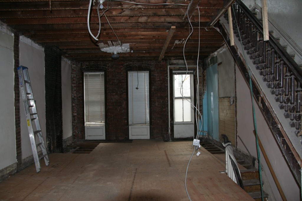
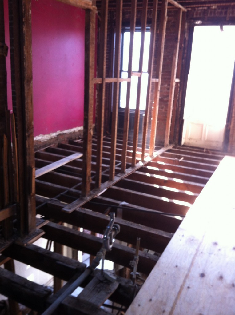
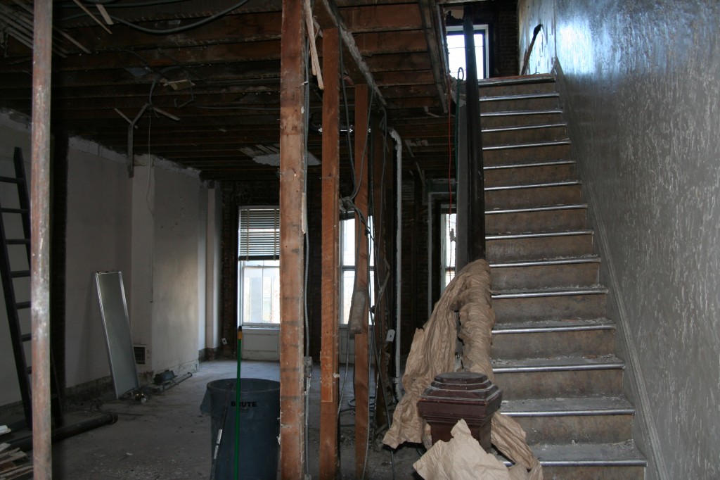
Parlor floor looking to the back where the new kitchen will be.


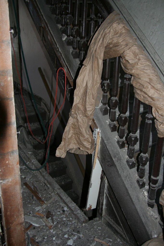
Removing the wall between the two parts of the house revealed that the siding to the stairs had been removed.

Old bathroom to be replaced with a dining area.


One item I had sincerely hoped to keep was the parlor level medallion.  Before what was likely many, many coats of paint, it must have been a lovely, well-scaled piece of plasterwork, but in truth, it had seen better days and better detail. With so many thick layers covering the work and weighing down the ceiling, it would have been difficult to marry it into the new ceiling layout, and with absolution from our architects, I’ll bit it a fond farewell. We’re hopeful to perhaps replace with either a new medallion, or, if the budget allows, a snazzy tin ceiling.

Sandy, the fallout continues…

15 Nov

We certainly considered ourselves very lucky to have suffered no direct damage as result of Hurricane Sandy, but we are sorry to say that Sandy has officially been an impediment to our renovation nonetheless. We lost a few weeks after approvals due to power outages and backlogs at various departments, our contractor’s home suffering serious damage and now, something one would never think of as a problem: the indefinite suspension of alternate side of the street parking for much of Brooklyn. While you can hear the cheers neighborhood-wide from those thrilled not to have to move their cars, our need for a long, clear strip of parking area to accommodate a container to cart away our debris means that work will virtually cease for another week. Sigh.

Demo begins

10 Nov

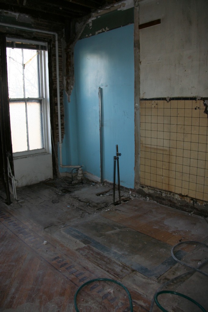
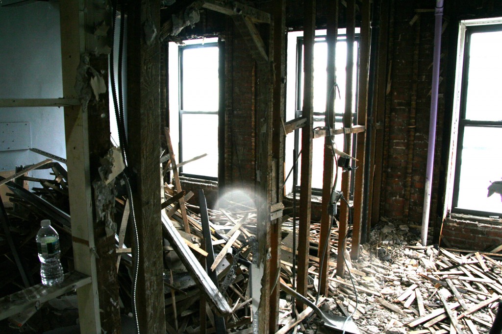
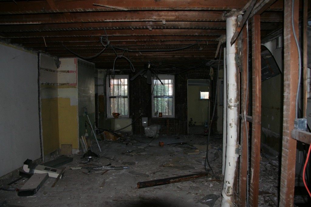
Another awesome job by our expeditors to renew licenses and pull permits saw our work start a little earlier than expected. The guys started with demolition of the top floor which was being used as a two-bedroom apartment.

It was great to walk in a see five guys making a big mess in the space that we plan to put three bedrooms, two bathrooms and the laundry.

Future master bedroom


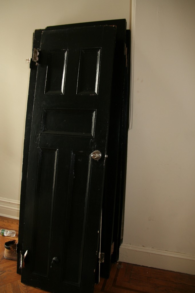
This level wasn’t originally it’s own space so the bathroom and kitchen were added. This meant that there isn’t a lot of original detail to try and save on this floor. However we are hoping that the original doors and shutters that remained can be reused and have put them aside to see about stripping the layers of paint added over the years.

Doors to save


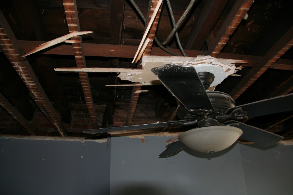
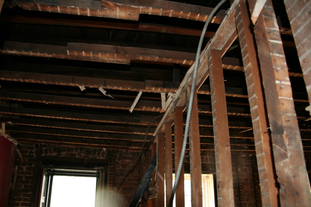
Now that the ceiling is removed we’ve noticed a little bit of space above the existing ceiling. We were really happy with the existing ceiling height on this floor but it would really be something if we could add another foot or so (we know we are going to lose some height with duct work etc.).

Potential ceiling height


High view to front of house


Next week demo will continue. Also, there’s a little cleanup to be done after discovering a little surprise when we dropped by today to collect mail.

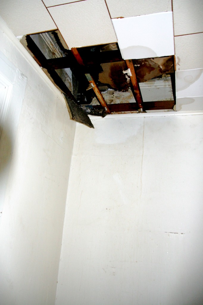
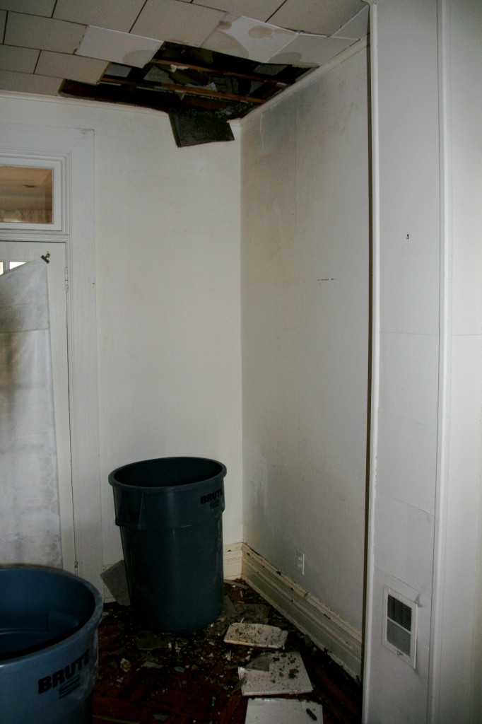
On the way up to the top floor there was a little mess on the parlor floor. At first I thought it was the workers removing part of the dropped ceiling so that we could see whether the original ceiling is worth saving.

Hole in the parlor ceiling


Unfortunately I quickly noticed the floor was wet and then saw water dripping from the ceiling. It seems that when the bathroom on the top floor was removed a leak was caused.

I grabbed some buckets used for debris removal and place them under the drips, turned off the main water line and called our General Contractor. I think it’ll all be OK but 1. I’m glad that we took an early morning visit over (this was the result of about 12 hours of drips) and 2. I don’t feel so bad we are paying a little extra to stay close by while the work has done. If we’d left this over the weekend the damage could have cost more than the money we would have saved from being a little further away.

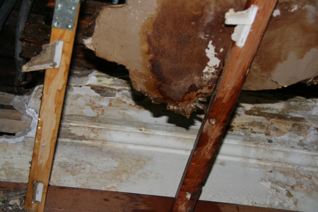
On the bright side, it did allow us to peak into the original ceiling. Unfortunately we saw that when the bathroom above was installed they cut away a fair chunk of the original detail. We were hoping for something worth working with but seeing this confirmed our suspicions. The layout of this level (which we’ll discuss in a post soon) doesn’t really match the original layout so working with the original detail may not have been that easy anyway.

Original molding on parlor floor.

We’ll confirm once the rest of the dropped ceiling is removed next week.

Basement level in detail: bathroom

2 Nov

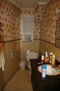
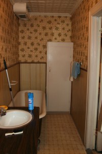
The name of the game in our new home will be “transitional.”  We’d like to respect the era of the house and maintain and/or replicate as much as possible throughout, but much of the actual materials will be new.  There are some parts of the house, where we will not attempt to salvage materials: namely, the basement bathroom.

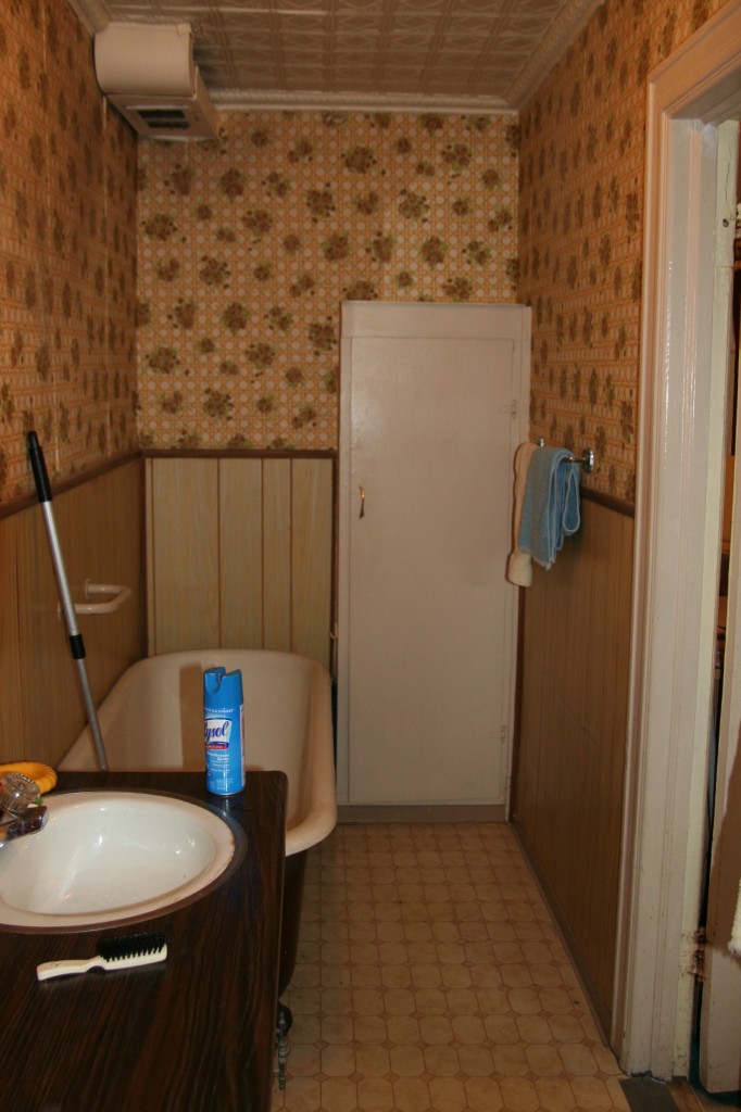
Notice the Alice in Wonderland effect of the walls? It isn’t your screen resolution.

Original clawfoot tub, and some seriously 60s wallpaper and paneling.

There is an original clawfoot tub that is unusually long, but I’m afraid that the more modern, clean take on the bathrooms throughout the house, plus the smaller footprint of these spaces, will mean the tub will be donated. We may try to re-purpose the tin ceiling in the parlor powder room, if there’s a segment that is in good enough shape to salvage.

So, here are some photos of planned components for the space:

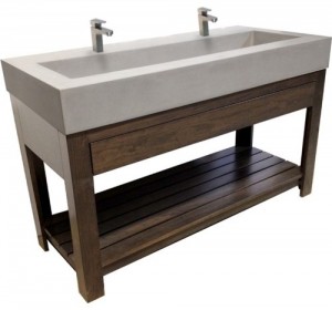
Sink: we’re going for a concrete poured sink as this space will be used by kids, gym goers and gardeners primarily. We want something that will be easy to clean, functional but also really snazzy.  Here’s a photo of what we’ve going for:

Garden Sink

Concrete trough double sink with open shelving below.

This sink is from Trueform Concrete, which is unfortunately a bit out of our budget. We’re hoping to have something similar fabricated by someone locally.

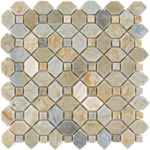
Floor tile: again, we’re looking for something that will easily mask the inevitable fingerpaint disasters ahead of us, so we’re opting for this awesome slate tile from AKDO:

This is Slate Trellis (tumbled) in Desert Sand. It is surprising affordable too, given how intricate and interesting the pattern.
Wall tile: This is one area that we are going to decide on when we head to our beloved Home and Stone showroom to place the rest of our order. We’re looking at a larger sized tile, stacked (not staggered like subway) in a coordinating color (similar to the wet room photo below, though probably much lighter in color). This tile will be used in the shower and bath area. Stay tuned.
Faucets: we wanted a one handed option for messy hands. This Grohe version fits the overall bill:

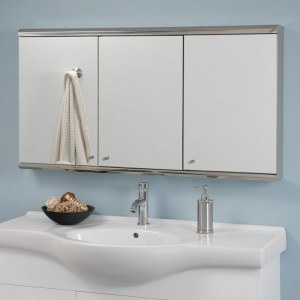
Medicine Cabinet: Since the adjoining space will likely be used for guests (and as anyone who lives in New York knows, guests often tend to stay a while), we’ve decided on an oversized medicine cabinet for storage. This may not be the final selection, but we’re leaning in this direction:

Hard to tell from the photo, but this is mirrored inside and out and will extend the length of the sink.

Bathtub: Since the tub will be within a larger wet room, we just wanted something simple and easy to clean. This is very similar to the tub we put in during a previous renovation (this one is by Zuma), and we were very happy with the overall function:

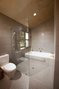
Here is a visual of the “wet room” mentioned above:

Wet room concept: shower and bath within one space to save room.

Since the space isn’t huge, in order to accommodate both a shower and a tub, this will be a great solution. We may choose a more enclosed glass option once it is time to order for more of a steam room effect, but this is a good starting point.

Lighting: The room will have a few recessed lights for function and a light bar over the vanity to tie everything together.We liked the unusual shape and color of this Garbo Wall Sconce, carried by Lightology, but we’ll hunt for a more budget friendly version.

Thanks for reading! Comments and material suggestions are more than welcome!

Let’s Begin Part 1 – Basement Level

1 Nov

Big news this week as our plans were approved by the city!

Before we talk about what we are planning to do, let’s take a quick look at our plans for each floor.

The house was originally a one-family home that was converted to a two-family sometime between 1884 and the 1960s. The basement and the first floor was generally used by the family that owned the property and the second floor was rented out.

The basement currently consists of three rooms and a bathroom with an attached laundry room.

Basement bathroom

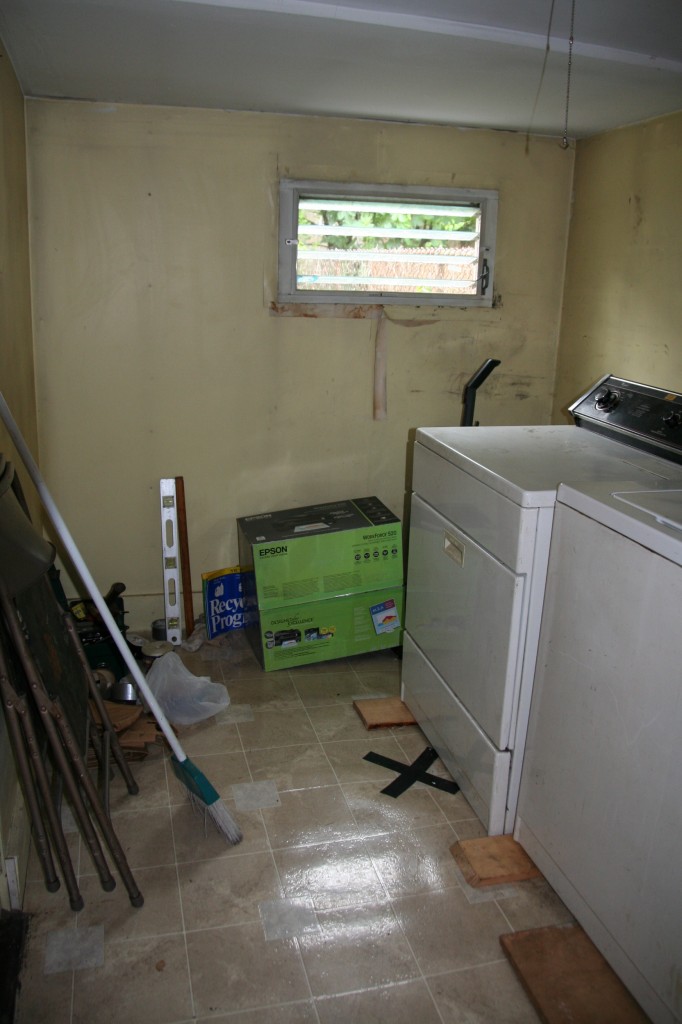
Laundry with extension

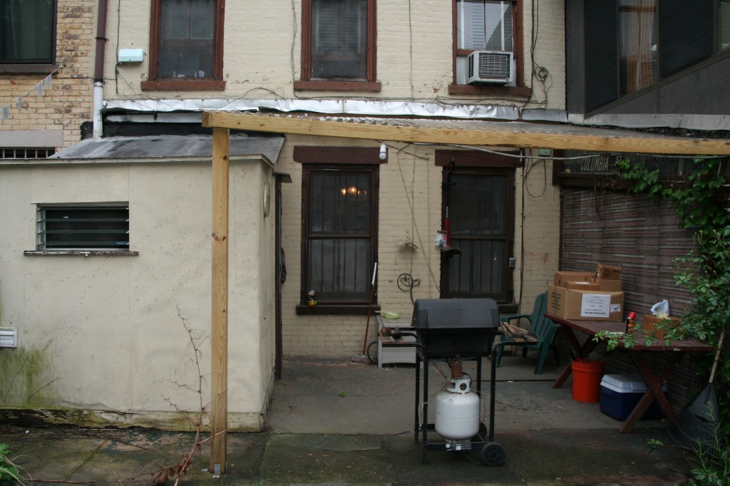
View from back.

Basement is sort of a misnomer because it has 8 foot ceilings and is above ground, but because it isn’t at street level, it qualifies as a basement in the city’s terminology. Our plan for this level is to largely keep the room breakdown intact (minus the extension). We’ll keep three spaces on the floor with a garden.

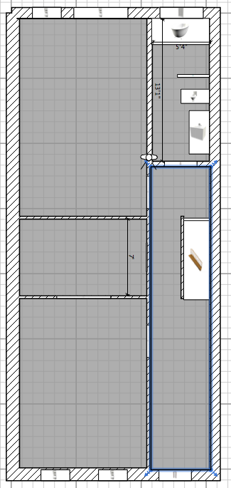
Planned basement floor plan

The room in the front will become the home office with a side room for a small gym. The backroom will become the playroom for the next few years and later a TV/Den area. In our endless search for a house we saw a house a few blocks away where the playroom connected to the backyard and we really liked that idea.

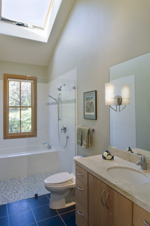
The bathroom presented an interesting challenge as we wanted a good sized bath and shower in a long narrow space. In poking around on Houzz for inspiration, we found this bathroom which we both immediately knew would fit the space perfectly. Our architect likes this layout but has said clients in the past haven’t shared his enthusiasm. We aren’t sure why.

Contemporary Bathroom design by San Francisco Architect John Lum Architecture, Inc. AIA

We’ll explore specific details about our planned bathroom and other details on this floor in a future post. Next time though, we’ll move up to the parlor floor (officially referred to as the first floor).