Drumroll please…parlor floor before and after
7 Feb
And without further ado, the heart of our home. *Please note: you can click photos for a larger version. There were so many in the post that the larger shots slowed the page down substantially*
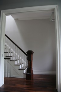
The parlor was previously the top floor of the lower duplex space. In the entry way, there was a large wall running along the staircase leading up to separate the two apartments. That wall was removed to allow a much more pleasing view right as you enter the house.
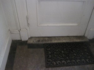
ENTRY BEFORE:
The entry had an old stone slab with a diamond pattern in the center. We had hoped to preserve it but it unfortunately was damaged significantly during demolition.
ENTRY AFTER:
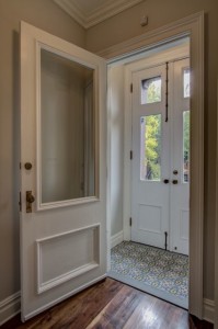
Custom tile from the Cement Tile Shop lines the entry way, the old safety grates were removed from the front doors and extra lighting was added out front and in the entry vestibule, making what was a dark space into a welcoming entry point.
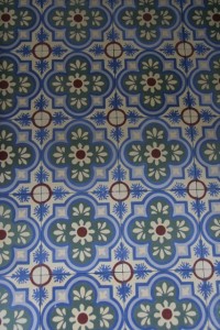
We spent many an hour designing the color scheme of this tile, and the folks at the Cement Tile Shop couldn’t have been nicer. We are very happy with the final results.
PARLOUR STAIRS BEFORE:
The stairs heading up to the top floor were made of some odd non wood substance and they were edged by bands of metal. The handrail was a beautiful mahogany piece but it unfortunately got chopped up when one of the early owners of the house split the home in two. We had hoped to incorporate it into our new handrail, but holy cow is mahogany expensive to replace. We hadn’t anticipated replacing the stairs altogether, but they were virtually collapsed after a few weeks of work, so everything is now new. We’ve kept the original handrails and hope to perhaps redo the rail at some point down the road.
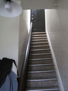
Parlour stairs leading to the top floor before. Not the heavy plaster wall on the left, which was removed to rejoin the house into a one family home.
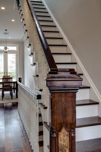
View from the front to the back of the house. Wonderful to see out to the yard right when you enter the home. Makes for a really simple but dramatic entry vista.
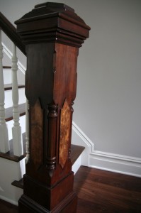
We did, however, restore and have refinished the original parlor post, which we love having as our solid totem when our guests arrive. It had been painted heavily in black, but it turns out that it had a beautiful inlay piece on all sides. The light fixture is from Lightology. The wall color is light pewter. The entry doors are also the original doors. The pocket doors are new and were supplied by Brooklyn Window and Door. The post and original doors were restored by the Tinker’s Wagon.
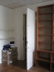
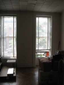
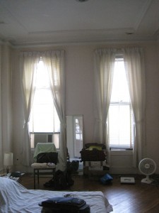
FRONT ROOMS BEFORE:
The front two rooms were originally used as bedroom and storage space for the previous family. They were good sized spaces with potentially high ceilings (the ceilings were dropped) and we were hoping there was crown moulding we might be able to keep. Again, the creation of the apartment upstairs meant that the moulding under the dropped ceilings was actually chopped up and in some disrepair, and given the heavy cost of removing over 100 years of paint with little hope that the fragile surface would sustain the construction above, we opted to replace with something similar.
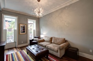
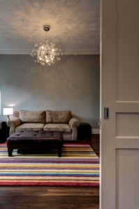
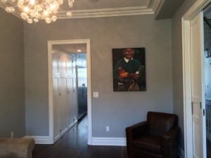
LIVING ROOM AFTER:
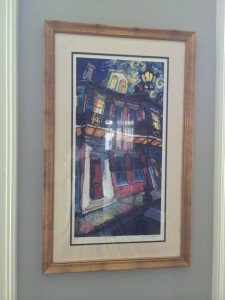
Print by James Michalopoulos. A wedding present from some dear friends, it somehow now captures the spirit of our home renovation process and holds a place of pride in our living room.
The chandelier is the Solaria Bubbles Chandelier, purchased from Clayton Gray Home. We waited for a nice coupon and are glad we did – it gives off the most amazing light in the room and makes everyone a little giddy when they walk in the space. The wall color is Coventry Gray by Benjamin Moore, and trim work here (and in the rest of the house) is Benjamin Moore White Dove. The crown is from Architectural Depot and the moulding around the windows and baseboards is from Kuiken Brothers. Shutters are by Devenco (shutterblinds.com), also known as Americana. Flooring is again 5 inch wide character grade American Black Walnut, as it is throughout the house.
The room needs to be decorated at some point, but that may be years down the road after our young children have done their best to put their own “stamp” on our hum-drum safe Pottery Barn furnishings and Safavieh rug. For now, we’re just happy to have a room to sit and share with friends and family.
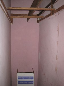
MIDDLE AREA BEFORE:
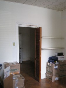
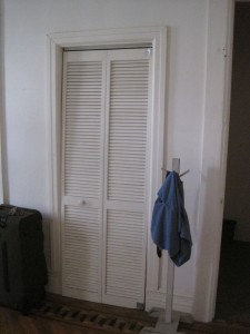
The middle area of the parlour was a railroad room with a couple of closets connecting the front bedroom to the back bedroom.
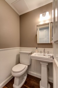
PANTRY AND PARLOUR BATHROOM AFTER:
The middle area now includes a coat closet, pantry and parlour bathroom.
Sink and toilet are Toto Promenade, Tilting mirror and sconce are Restoration Hardware. Faucet and fixtures are Jaclo Roaring 20s line.
MASTER BEDROOM BEFORE:
It had a master bedroom in the back with a small bathroom and a large closet off to the right.
KITCHEN AFTER:
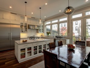
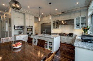
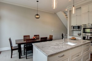
The kitchen was were we (and our contractor, engineer and architect) put our blood, sweat, and tears (read: every last cent) and we enjoy every minute we spend in here. It is the space we fantasized about for years and I still pinch myself daily that I get to cook and live in this amazing space.
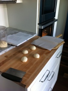
Hood is custom made by Modern Aire; rangetop is 48 inch with grill by Bluestar (best money ever spent); dishwasher is the Bosch 800 Plus Series; Miele fridge and freezer really are as enormous as they look and we love ever inch of them (36 inch fridge, 30 inch freezer – both counter depth, so in truth they are surprisingly shallow and thus not as big as you’d think) – we frequently fill them with cakes, stock, confections for upcoming parties, you name it; ovens are DCS (finicky but do a great job and have the best broiler I’ve ever seen in an electric oven); sinks by Blanco; Sharp under cabinet microwave; faucets by Waterstone, and yes, the main faucet is a work of art and a functional marvel. Countertop is Super White (White Quartzite) supplied by Marble.com. Cabinets were custom made by Naccarato Contracting (wood painted White Dove by Benjamin Moore in a satin finish). Hardware is by Alno. Lighting by Niche Modern. Carpet tiles by FLOR. Wall color in the kitchen is Light Pewter by Benjamin Moore. The baking station slides in an out and was designed to be at the lower level that is preferred for bread kneading (maple top is by Boos). Dining room furniture is by Crate and Barrel. Dish drying rack by Simple Human.
And yes, in case you were wondering, it is often the case that we have at least 4 of the burners and the grill on simultaneously. Huzzah.
Thanks to all for following on our great journey with us! If you are reading this blog because you are in the midst of or about to embark on a renovation journey, GOOD LUCK!!! While so many days are painful and tedious, scary and full of anticipation, remember one key thing: like childbirth and plane rides to far away exotic places, renovation is a long and painful process which ends eventually, and everyone who goes through it has a story to tell in the end; hope yours is a good one.

