Blue or Grey?
27 Nov
One benefit of having started our renovation later than expected is the bevy of Black Friday and Cyber Monday sales we were able to take advantage of as we start the shopping spree. Faucets, shower bodies, tubs, toilets and accessories have all been ordered (details in a future post), and we’re finalizing many of the other selections. Next on the “big” list will be confirming our tile choices, which we’ll order once the room sizes are 100% confirmed and we’ve had a chance to review our tile choices with our architects.
One item that couldn’t wait for a later date was our kitchen lighting. I actually won a contest over the summer with one of our favorite lighting sources, Niche Modern, so we’ve decided to splurge and make their beautiful pendants the focal point in the kitchen. A Black Friday sale is forcing our hand earlier rather than later, but we are still torn in terms of the color; this is where you, dear readers, come in!
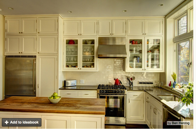
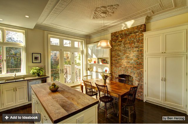
So, to give you an idea of what our kitchen will look like, here are the initial inspiration photos that very much replicate our layout and overall aesthetic:
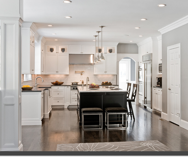
Our kitchen will have a similar layout, though our appliances will be larger overall, and our color scheme will be different. We will have satin white, shaker cabinets, walnut floors, and grey granite countertops. The color scheme will actually be quite similar to these two kitchens (without the dark island – our island will also be white):
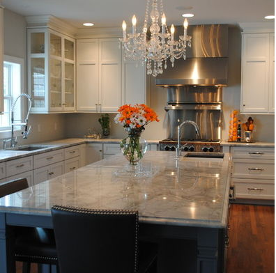
Another white cabinet, grey counter kitchen, this time with the fairly industrial hood and range combo we are going for as well.
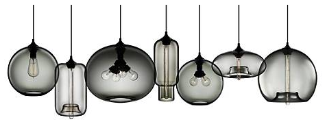
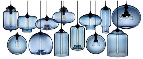
So, why all the preemptive background, and what does this all have to do with our post title, Blue or Grey? We’re deciding between the two for our lighting choices. Here are the line ups on the Niche Modern website:
The Greys:
The Blues:
The Clears:
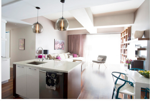
We will definitely be using two of the longer, bell shaped lights over the island, and one of the four pronged lights over the dining table. The only question is, in a kitchen with lots of white and grey already, do we go with the grey four pronged Terra over the dining table with clear bell-shaped lights over the island (they don’t make grey bell-shaped lights), or go for blue for all three? Here are some grey and blue lights in similar color schemes:
The Blue light room:
And the grey scheme:
Help! We welcome your thoughts.



Pingback: Kitchen Survey: Backsplash! | Wandernesting