Drumroll please…top floor before and after
30 Dec
The top floor was originally a separate 1 1/2 bedroom apartment, with a kitchen, bathroom, living area, and the typical small bedroom with one window, larger bedroom with 2 windows combination that is so common in Brooklyn brownstones. We wanted to transform this space into 3 bedrooms, 2 bathrooms, a linen closet, a laundry area AND keep the required access to the roof. A tall order, but nothing brownstoneboy, a protractor, scientific calculator and some good old fashioned ingenuity couldn’t solve.
First, the two kids bedrooms, to be constructed from the small/larger bedroom duo. There are a few ways to tackle this issue:
1. Leave the walls as is, otherwise known as the “who’s your favorite child” solution.
2. Make a zig zag wall, leaving one room with two windows, but giving them effectively the same amount of floorspace. Each room would have a large nook for a desk or bed. Had our architect not come up with a really great alternative, we would have gone this route
3. Make a diagonal central wall. I can certainly see the appeal of this in a more modern renovation, but we’re just a little too traditional for that solution.
4. The “King Solomon” solution: splitting the baby right down the middle.
We chose door number 4 and are very happy we did. Both rooms feel ample enough, they get an equal amount of light, and there’s a fun secret chat window that our kids can leave open or closed. The dividing wall is extra insulated, and there’s soundproof, weather-stripped push latch windows as a secondary inner window. The exterior window remains untouched, and the new shutters we installed are left closed, so that you’d never notice the solution from the outside. Genius. Thanks again to Ben Herzog for this brilliant solution!
So, without further ado:
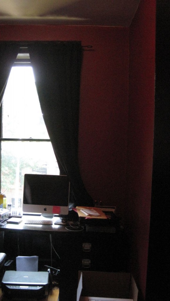
TOP FLOOR Larger BEDROOM BEFORE:
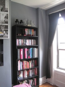
TOP FLOOR LARGER BEDROOM AFTER:
Brownstonetoddlerboy’s room. He alternately loves and fears the stars. The split window is on the left. Color is Benjamin Moore Silvery Blue.
Note the effort to find a similar moulding and the work on the split window. Another item makes this bedroom feel more spacious: both chimneys in the house were removed (note the chimney on the right hand side of this room). Neither had working fireplaces, so it made for less complicated room shapes to remove them altogether. It certainly would have been nice to restore one of them, but budgets are what budgets are, and with no fancy mantel to hold on to, it seemed the better option. Also, note how much higher the ceilings are in the after: there was actually an additional foot of space above the ceiling, so the front room ceiling height is now over 10 feet, making the smaller rooms feel far larger.
The shutters are new and were created by Devenco at www.shutterblinds.com. We highly, highly recommend them. They are a great company and do beautiful work.
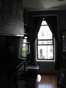
TOP FLOOR SMALLER BEDROOM BEFORE:
TOP FLOOR NURSERY AFTER:
Brownstonebabygirl’s room. Color is Golden Straw, same as the playroom.
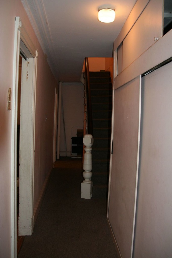
TOP FLOOR HALLWAY BEFORE:
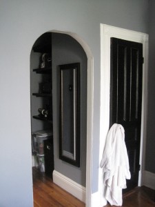
Hallway before. Technically, the Kids’ Bathroom is where this hallway really was before, but it serves as a visual.
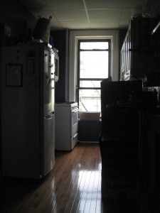
A view of the before hallway in the other direction. This was the tenant apartment kitchen before, now part of our master bedroom.
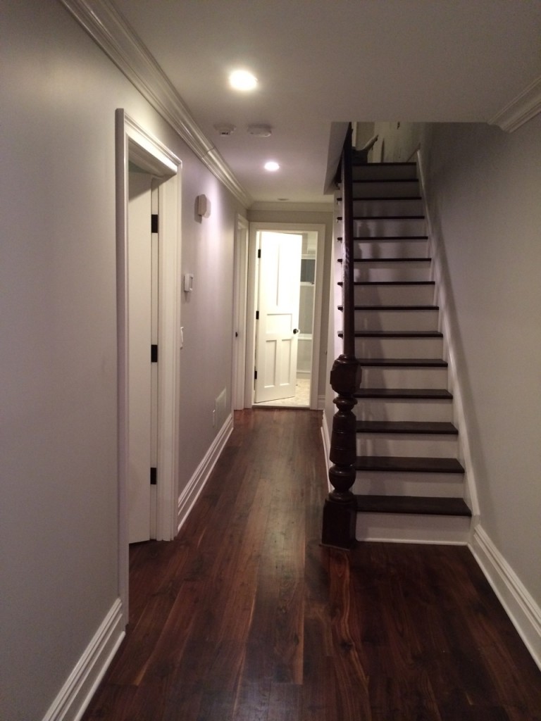
TOP FLOOR HALLWAY AFTER:
TOP FLOOR BATHROOM BEFORE:
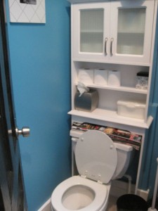
Upstairs bathroom before. Standard tub shower configuration – nothing wrong with it, just not located where it needed to be.
KIDS’ BATHROOM AFTER:
Kids bathroom after. Paint color is Iced Slate by Benjamin Moore. Grout is
Tile is penny tile from Supah Fish (Matte White Penny Rounds and Blue SD 244 Penny Rounds purchased from BuyTile.com). We went with a slate grout on the floor, which is SO much easier to keep clean than a white grout. Sink is the Aquamedia line by Lacava (42 1/2 inches wide with double sinks) in cherry. Vanity mirrors are by Pottery Barn, light fixture by George Kovacs. There was originally a skylight in the upstairs bathroom but it was in a slightly different location. It was moved and modernized and makes all the difference with the interior windowless bathrooms so common in Brooklyn.
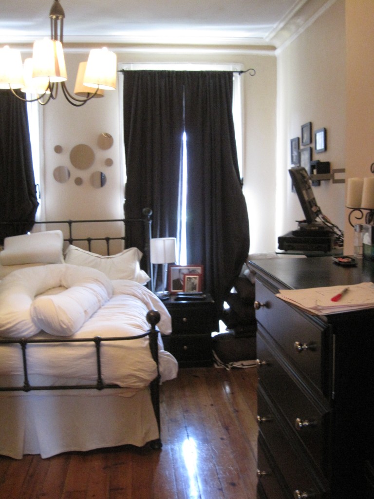
TOP FLOOR BACK ROOM BEFORE:
The top floor back room was the living space in the old tenant apartment. Note the chimney, which has since been removed, leaving more space for shoes!
TOP FLOOR MASTER AFTER:
Master bedroom. Paint color is River Reflections by Benjamin Moore.
Custom wall to ceiling closets were a compromise instead of a walk-in closet, but we’ve got his and hers on either side, and our bedroom feels far more spacious than if we had opted for the walk in. Overhead light by zGallerie, bed and tables by Pottery Barn, door hardware by Emtek. No window treatments yet, but we’ll get there!
TOP FLOOR MASTER BATHROOM AFTER:
Our master bathroom. Color is Grey Owl by Benjamin Moore.
There was no ensuite bathroom in the old tenant apartment, but we made that a priority in the limited space. We’re very happy with the results.
Double showerheads were a must (these are by highpressureshowerheads.com and are spectacular). Doors were done by ABC Shower Door, vanity is 60 inch custom mahogany veneer over solid maple, created by our wonderful contractor, Naccarato Contracting. Stone and backsplash are white quartzite from marble.com. Wall-hung faucets (aka my nemeses) and all accessories by Grohe. Mirror and lighting by Robern. Sinks are Kohler Archer undermount sinks in White. Drains are Kraus PU-11CH Pop Up Drain with Overflow, Chrome (I know it seems silly to mention the drain, but we had a hard time figuring out what sort of drain is needed with an undermount sink and wall mounted faucets. These were the right kind). The skylight is new. Tile is Akdo basketweave carrera bella with lunar gray glass dot inserts, carrera bella 3/4 inch mosaic in the shower floor, and Canco’s white wall tile on the shower walls. Thermostatic valves in the shower are by Grohe Atrio.
Best thing in the bathroom, though, is the fan on a 60 minute timer (see our previous post on the 5 best things we’ve done thus far). Not a mildewy towel among them.
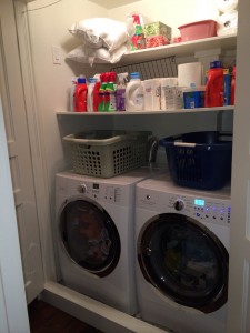
TOP FLOOR LAUNDRY AFTER:
One more item needed to be squeezed into the top floor: the laundry. The laundry was off of the garden floor kitchen in an extension that has since been demolished, so we wanted it to be accessible in the most practical space. If you can put your laundry near your bedrooms, we highly recommend it (with extra thick doors for those late night washing/drying emergencies).
Machines are Electrolux IQ Touch. Great machines, though if we were to do it again, I’d recommend the Wave Touch. The salesperson we initially spoke with swore the machines are identical, but the Wave Touch has one feature (alternating tumble) that would be nice to have for keeping sheets untangled during extended tumble periods. Regardless, they really are amazing machines and we are very happy with them.
The top floor was truly a jigsaw puzzle and the rooms aren’t huge, but we’ve managed to fit everything we need for 2 adults and 2 kids in the space. Each room is light and bright, and the whole space really flows well.
Next up, the final space: the parlor floor! We are saving the best for last.

Recent Comments