Archive | December, 2012

Kitchen Survey: Backsplash!

28 Dec

So, we have a moratorium in place in our house on discussing our kitchen backsplash, as we’ve gone over it a thousand times already with no answer in sight. We were thinking of waiting until the kitchen is complete and making a decision at a later point, but our contractor has indicated it might be best to begin setting whatever we choose before the cabinets and countertops are installed, giving a more seamless look.

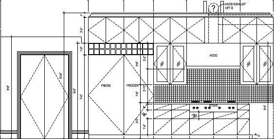
So, first, here’s the floorplan of our new kitchen (a broader post on the kitchen itself will happen soon):

Floorplan of our new kitchen. Big. Dreamy.

The only area that will actually have a backsplash is the wall with the rangetop.  The remainder will be finished with millwork and a dreamy wall of windows. Here’s a view of the part of the kitchen that contains the backsplash:

Range wall with backsplash area.

As you can see, we’ll have some heavy hitters on this wall: a 36 inch column refrigerator, 30 inch freezer, 48 inch commercial rangetop and a 54 inch stainless hood.  All great stuff, but lots and lots of metal going on.  The backsplash, however, is quite small (The cross-hatched area is the only area where we will have the backsplash).  Depending on the trim we use for the range, it might be 10-20 sq ft at the most.

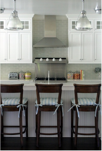
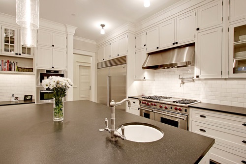
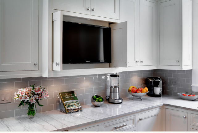
The layout will look fairly similar to this inspiration photo (including the limited amount of visible backsplash, plus our cabinetry will be similar, and we’re using the same lights in clear glass over the island):

So, here are a few elemental photos to get you in the spirit of the design (again, more will be a general kitchen post very soon!).

Color scheme:

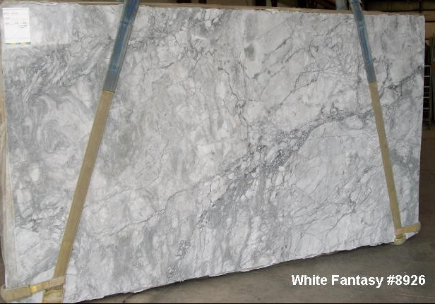
Cabinets will be white, countertops will be grey and white granite or quartzite (white fantasy or super white granite), floors will be walnut.  Here’s a photo of a white fantasy quartzite:

White fantasy quartzite.

Stronger than marble but with the look of marble, we used this beautiful stone in our old master bath and loved the look.   We hope to find a slab with more of the swirling bits when it is time to purchase.

The overall color scheme will therefore be something like this:

Hood and hardware:

What will go directly above the backsplash?  I imagine this is an important factor to consider. Here’s our new baby:

Modern aire PS-26 hood in brushed stainless with polished steel rivets and bands.

With some jockeying back and forth, we were able to eek out a great deal. Isn’t she pretty?  We’ll also likely be using similar polished chrome cup style pulls, albeit with different knobs on the upper cabinets.

Cabinet style:

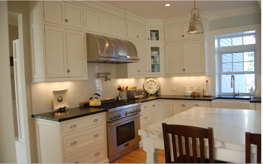
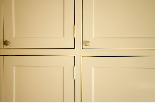
We’re going for an updated traditional/transitional look throughout the house, so the cabinets will be an inset, concealed-hinge beaded face frame design.  Too technical?  They’ll look something like this, but with hidden hinges:

Beaded face frame cabinetry.

Backsplash choices:

So, that leaves us with the ultimate question: what to do with that 10-20 sq feet of backsplash? Our beautiful lights, the wonderful light from all the glass at the back of the kitchen, the hood and of course, all those wonderful appliances will be enough to take center stage, but that wall will need some sort of protection.  Do we therefore go with:

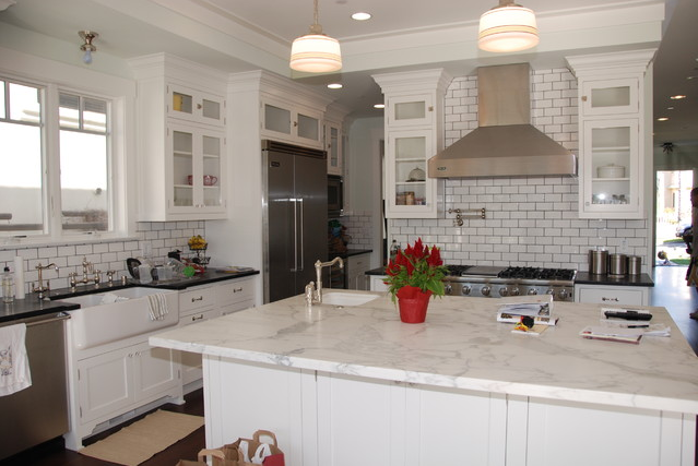
White subway: classic, but boring? If we go with white subway, do we go with white grout or dark grout for a more period look?

White subway backslash with white grout.

White subway with darker grout.

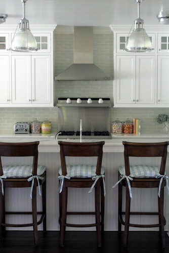
Gray subway: many options here (ceramic with some color variation, glass, opalescent, or high gloss. Too much gray?

Grey subway option #1: ceramic with some color variation.

Grey subway option #2 – glossy with no color variation.


Stainless – range panel only:

Stainless panel with shelf just behind the range. Our range and hood will be 24 inches narrower, but the finishes will be similar.

Stainless – entire backsplash:
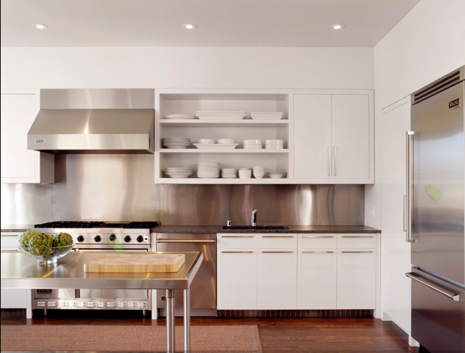
All stainless backsplash. This has been the frontrunner, but our concern is the 66 inches of stainless fridge/freezer wall directly next to it, plus the 54 inch stainless hood and 48 inch stainless range all flanking it. Too much metal?

Pattern: The variety of patterns abound, of course, but we have narrowed it down to one that we are still considering:
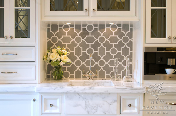
And the wildcard: Chatham New Ravenna in stone. The pattern sort of mirrors the lighting we’ll have in the kitchen in a nice way.

If you aren’t familiar with New Ravenna, their stuff is stunning but pricey. However, given the small area we’ll need and the relatively more affordable pricing on this particular tile, it is still in the running.  I also like how it complements the shape of the lights we’ll be using in the kitchen (see the blue or grey post for more on that).

So, dear readers. Do tell: what would make your heart sing when you walk into our fair gray and white kitchen?  We’d love your input.

Frames, pipes and more.

21 Dec

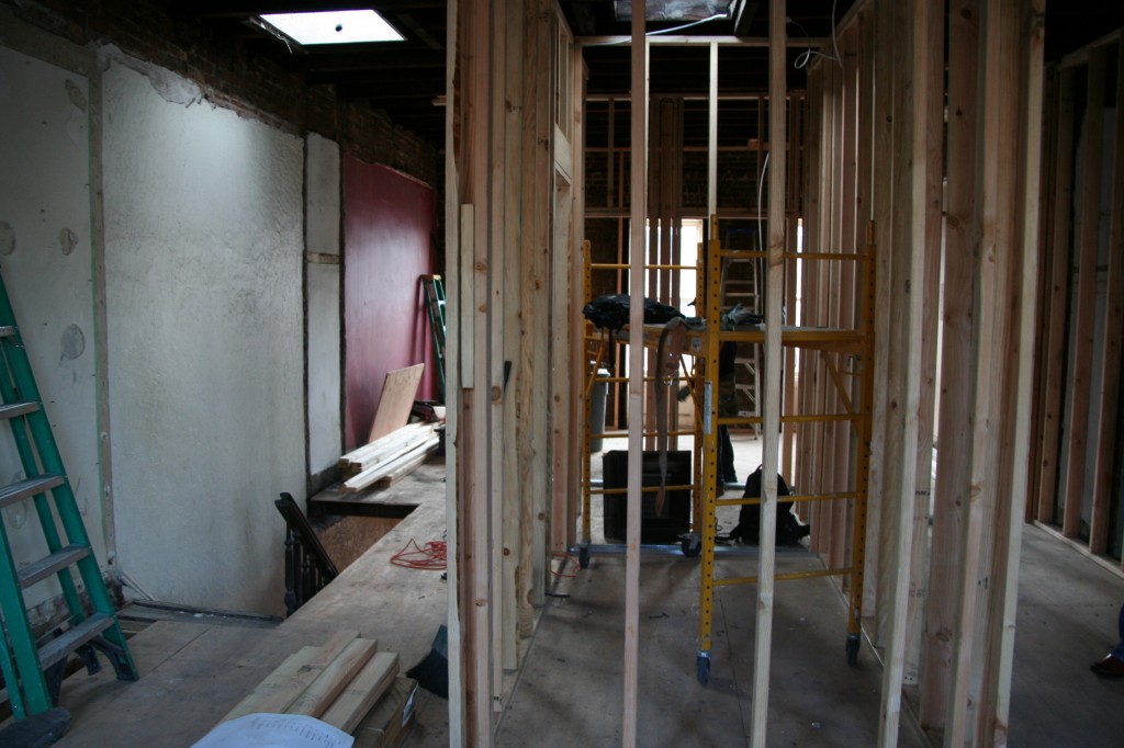
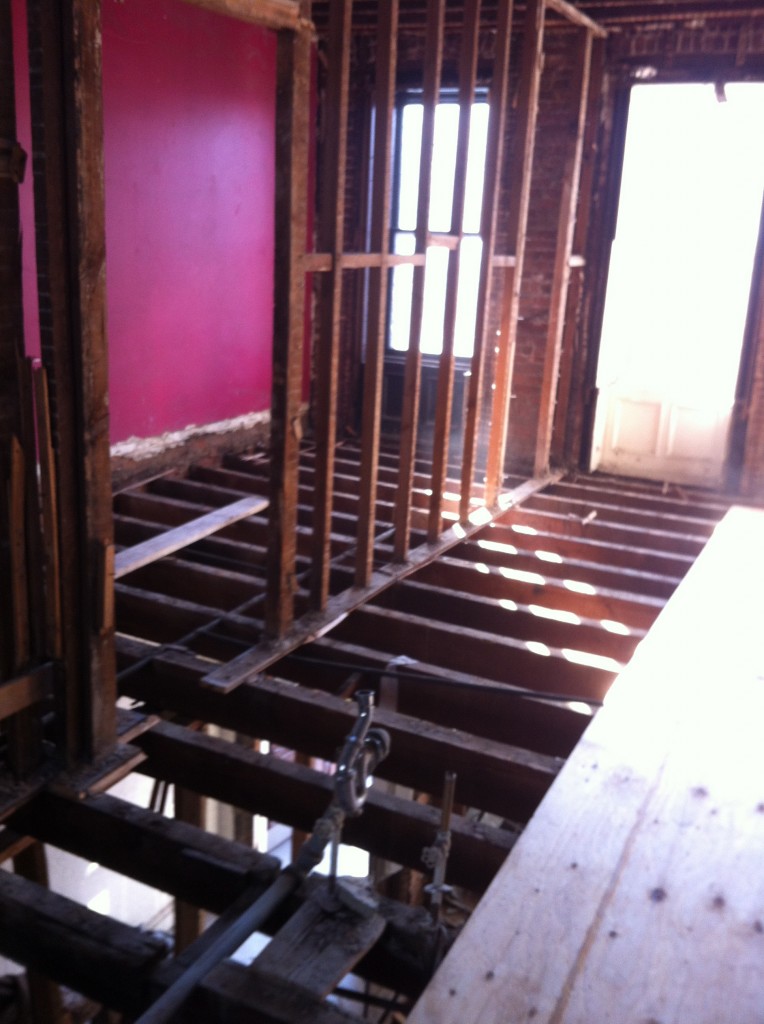
Lots of work to report this week as the plumbers have started putting in new drain lines and the framing of walls is nearing the end.

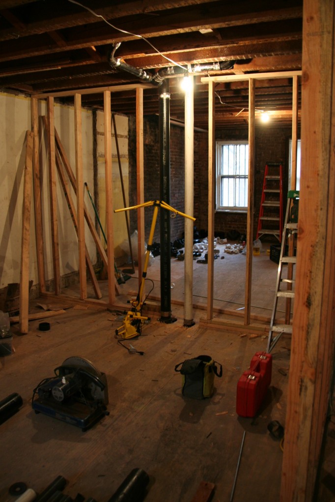
Garden level looking to back.

When we walked through the house last week with the GC and architects there was a lot of discussion around the parlor floor. We are fitting in a coat closet, powder room and pantry between the kitchen and living room and the space is tight (again our 18.75′ house width). It took a little adjusting but we were finally able to work everything out. We were a little nervous that we had ordered a toilet that sticks out too far when we lost a few inches in the parlor room. Fortunately when we got home we saw that  the toilet we ordered was a round front which are a little shorter than the elongated front. (We should have waited to order the toilet but got a great deal over Thanksgiving and couldn’t wait).
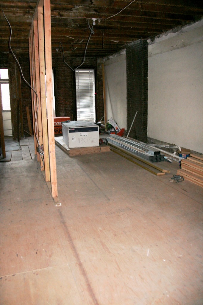
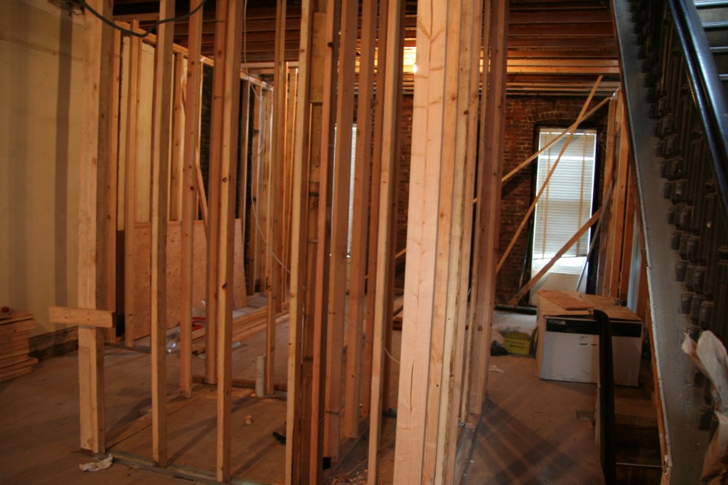
Parlor floor looking back to the kitchen

While the powder area is tight, our concern from the beginning was how the top floor would feel with three bedrooms, two bathrooms and a laundry. Now the framing has gone up things look good. The master bath is a little snug with our desire for a double shower but everything else feels OK. It was also great to be up there on a cloudy day in the middle of winter and still have great light.

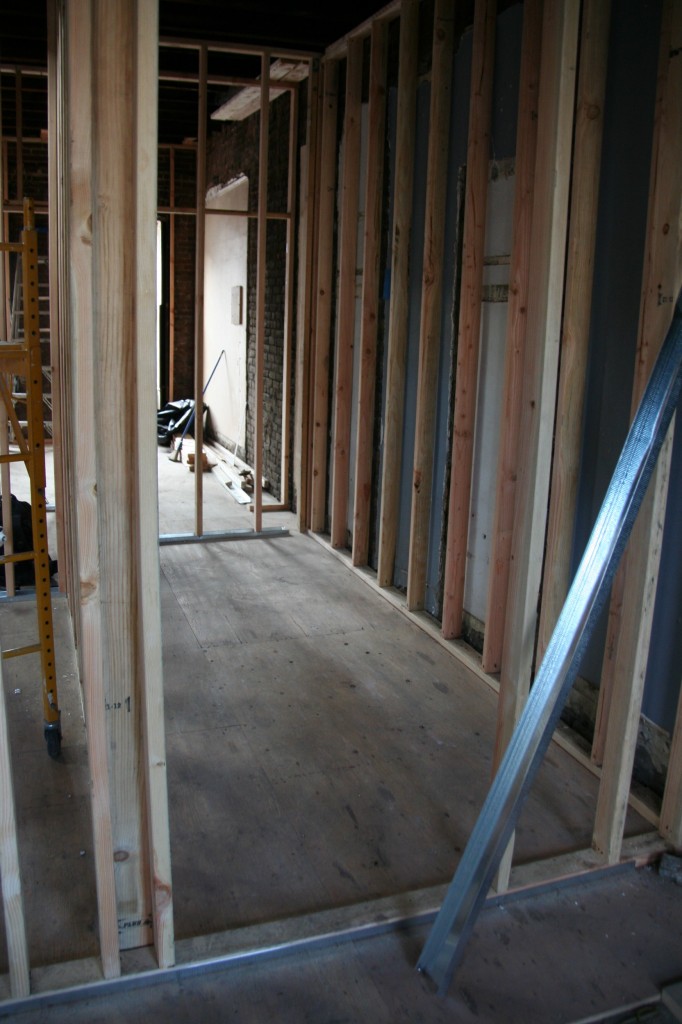
Master bath.

Kids bath looking to the front of the house.

Next week the plumbing work continues and the electricians get started. Work also begins on opening the back of the house. That piece requires close coordination between the GC, steel guy and structural engineer.


Room by Room: Parlor Bathroom. Which mirror? Lighting? Tin ceiling? You decide.

16 Dec

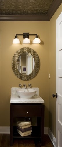
Although it will be the smallest room in the house, the parlor bathroom is likely to be one of the more visible rooms to our guests, so it is important that we do her up right. We’ve decided to go for a period look that we think will tie the old in with the new, and we’d love your help, dear readers, with two elements: the mirror and the lighting!

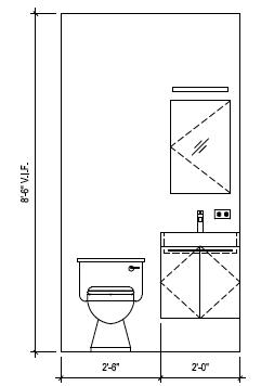
Here’s a rudimentary elevation drawing to show you what the space will look like:

Basic elevation. Sink will actually be a pedestal and the mirror and sconce are still up for debate!

Petite but functional.

So, the floors throughout the house will be 5 inch wide Character Grade American Walnut floors supplied by Premium Floors right here in Brooklyn with a natural, tung oil finish. Here’s an ooh and ah photo for natural finish walnut floors:

Character Grade Natural Finish American Walnut.

Character Grade Natural Finish American Walnut.

We love the look of the sleeker “select” grade walnut, but with 2 kids and the softer nature of walnut, choosing character grade means the floor will start out with some imperfections and will thus be less noticeable when dings inevitably happen.

The flooring will extend into the bathroom.

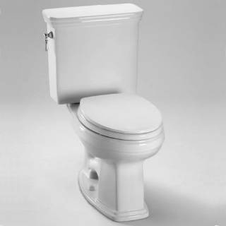
Here are the toilet and sink we’ll use in the space:

Toto Promenade Toilet.

Toto Promenade Sink.

We got a great deal over Black Friday weekend on Toto toilets and a bathtub for the kids bathroom from HomeClick.com.  We ended up with the Promenade model because of the 24 inch width. Most of the other Toto pedestals were 27 inches wide and 24 inches was our comfortable limit in this tighter space.

Faucets and accessories will come from Jaclo, the Roaring 20′s series:

Jaclo Roaring 20′s 8″ widespread faucet.

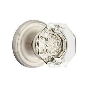
Doorknob from Emtek:

Emtek Old Town Clear Crystal Door Knob. Ours will be in Polished Chrome to match the fixtures.

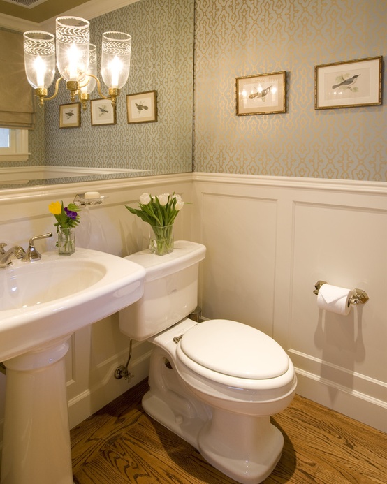
We were thinking of doing either a chair rail or wainscotting in this bathroom to complete the period look, but the “petite” size of the space will mean we need every inch. Therefore, I think a chair rail and nicely painted walls will finish the look nicely. Something like this:

Chair rail for powder room.

HELP US CHOOSE!

The final decisions in the bathroom are about lighting and mirrors: what kind? how big?  The mirror choice will define the lighting, so here are the contenders:

1. Full wall mirror: The room will be quite small (only about 5 feet by 4 feet) and will not have a window, so we thought it might open up the space to have a large mirror. The ceilings on this level are high though (even with the ceiling dropped to accommodate heating and other duct work, it will still be about 8 1/2 feet), so is too much mirror just too much?

Full wall mirror with some sort of embedded lighting. Too much mirror?

If we did that sort of mirror, lighting would probably be a recessed light plus an embedded sconce like this one:

Embedded sconces: sconces are mounted on the mirror itself.

Our sink is not that wide at only 24 inches, so one sconce may be all that we could fit.  The recessed light would help with additional wattage.

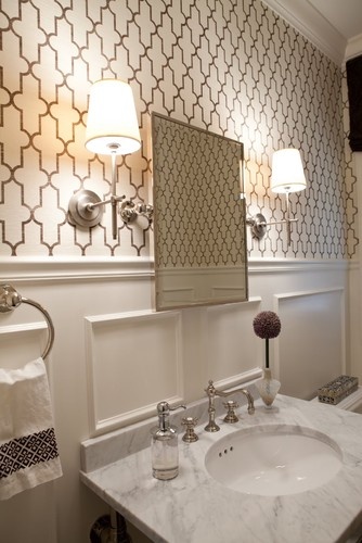
2. Tilting beveled wall mirror: I’m really drawn to the old-fashioned tilting wall mirror look.  I feel that it would work well in our bathroom in either a rectangular or oval shape. Our fear is constant fingerprints from guests compelled to moving it about. Should we worry?

Tilting mirror and small shade sconces.

The sconces would likely be similar, but again, we might only have room for one, given the dimensions of the bathroom.  Recessed light would also be an option.

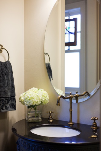
3. Standard wall mirror: So with a standard mirror, options abound. We could do something simple like a beveled oval or rectangular mirror:

Beveled oval mirror.

Rectangular mirror.

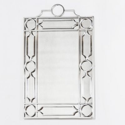
Or we could go with something with a little more graphic appeal like this one (chosen because it matches a backsplash we were and may still be considering):

Trelliage mirror.

For the simpler, non-tilting, non-blingy wall mirror options, we might still go with a simple sconce but an alternative would be a schoolhouse style light like this one:

Schoolhouse pendant.

So, dear readers, that just about covers it. Full mirror, tilting mirror, standard mirror, or something with a little graphic interest? Sconces or pendant? And, one final question: tin ceiling or no tin ceiling?

Thanks in advance for your help! The comments about our kitchen lighting received online and off were so helpful…we’ll of course share all final photos as a big “reveal” at the end of the renovation.

Sorry Santa, the Chimneys are Gone

13 Dec

The house is just a little bit lighter this week with the removal of two chimneys and the shed.

New kitchen space.

We were glad the chimney removal occurred without issue given most of our planned kitchen layout depended on its removal. Now we can move forward with appliance purchases.

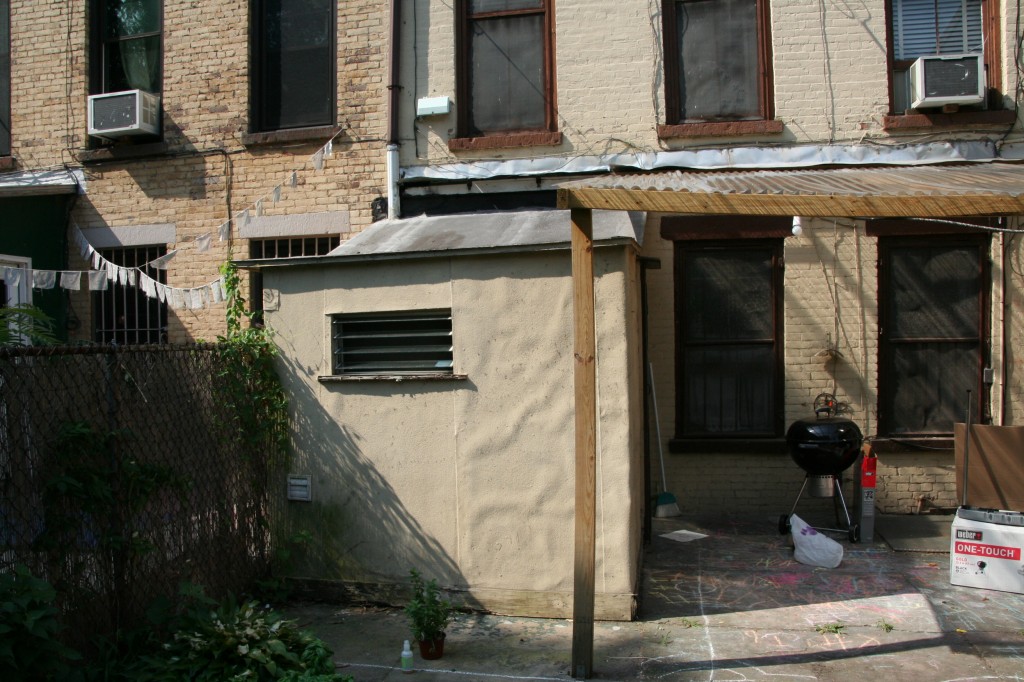
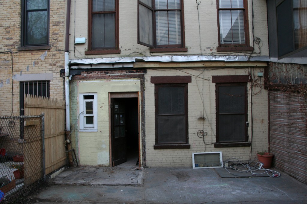
We were also pleased to see the shed come down without resistance. Here’s a before and after:

Before removal.

After shed removal.


It is nice to take a walk around the backyard and feel so much space (for New York that is – 18.75′ wide anywhere else would be a side passage)! It won’t be long, though, before we put up a deck which will provide access to the backyard from the kitchen. In the meantime you can enjoy what inspired our deck choice.

Deck inspiration.

Our deck will look very similar (just flipped so the stairs come down on the right). Our kitchen window will also be showing our awesome faucet (see previous post).
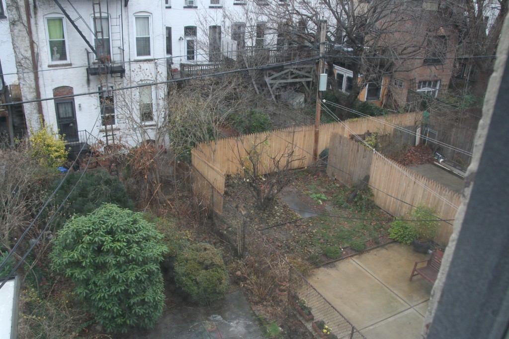
Maybe the neighbors were getting a little jealous with all the debris being taken out. When I peeked out the back from our soon to be master, I noticed the fig tree next door received a bit of a trim. I guess this means we’ll have to lean a little further over the fence come the summer.

The fig tree gets cut.

This week, the subfloor continues to go down and tracks are being laid down to show where the rooms are to be positioned.

Flooring continues to go down.

Tomorrow we are meeting with our architects and GC to discuss any changes and confirm the room sizes. We’ve had so many iterations of our floorplan it’s a little scary to think that things are about to be locked in but it does mean one steps closer to completion!


Room by room: Living Room

4 Dec

The living room will be an easy room to cover: for the time being, it will be a nice sitting space with a beautiful light fixture, our current furniture and not much else. You’ve definitely got to prioritize when it comes to doing an entire house all at the same time, and things like built-ins will simply have to wait.  More Black Friday sales luck, however, made the light fixture something we had to go for sooner rather than later. Here she is in all her glory:

Solaria bubbles chandelier

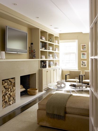
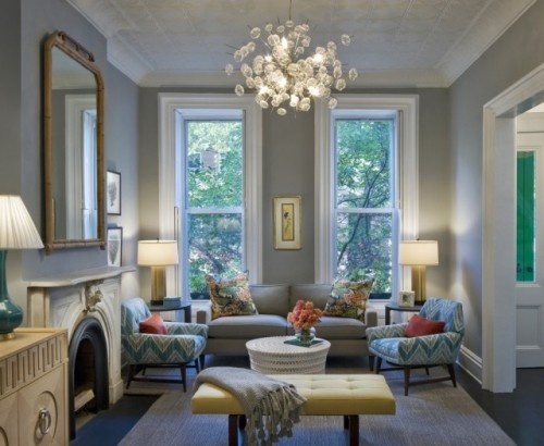
In fact, this photo of another Brooklyn brownstone served as great inspiration for our living room altogether. We too have a chimney in our space, though ours will be on the opposite wall. Ours also doesn’t have the lovely, period mantel that this one has, so it will be something we may try to find through Brownstoner or a Build it Green at a later date.  We’ll also try to find a great period mirror to complete the look.  The color is very pretty, too – for anyone who is interested, it is Benjamin Moore® Ben® Paint, Coventry Gray HC-169. We may, however, opt for something a little lighter and perhaps in a pale shade of blue, as our kitchen (the other major space on this floor) will feature gray prominently, but I’ve always been a big fan of gray, so you never know!

Our living room will have a similar opening, and our windows and ceiling height are all more or less the same, except everything will be reversed (our stairs and the entry to the parlor are on the other side).  Here is another inspiration photo:

Living room cabinet.

We had hoped to have the space for a separate tv area not in the main living space, but alas, space is always short and you have to compromise somewhere. We’re therefore going to eventually opt for some sort of built in in the living room to house the tv area, but this is probably an “after party” project (after the main renovation, that is).  The tv will be covered and the components area will have a similar grating to the photo above, but overall, we want a more built in look.  Our heating ductwork will go above this cabinet, so something more built in will keep things looking streamlined throughout. Here’s a final potential inspiration photo:


Built in for living room area. Ours will likely have grill work on the cabinet doors for easier component usage, some sort of doors to hide the television, and crown moulding to match the rest of the space.

Finally, the floors throughout the house will be supplied by Premium Wood Flooring, not far from us in Brooklyn. The old flooring was definitely difficult to part with as it was one of the few period details remaining in the house, but past renovations and changes to a two-family took its toll, and it would have been more expensive to restore the floors than to replace with some major compromises in terms of aesthetics and comfort (sound mainly).  The floors also required straightening from years of settling and were quite creaky in spots, which is easier to fix at the sub-floor level anyway.  It turns out that the old floor was actually very thin when it was pulled up, so it may not have survived the renovation, sanding and refinishing that would have been required.  Sorry to see you go, though, old floors.

The original parlor flooring. Very pretty, but thin, warped and super creaky. Still sad to see you go.

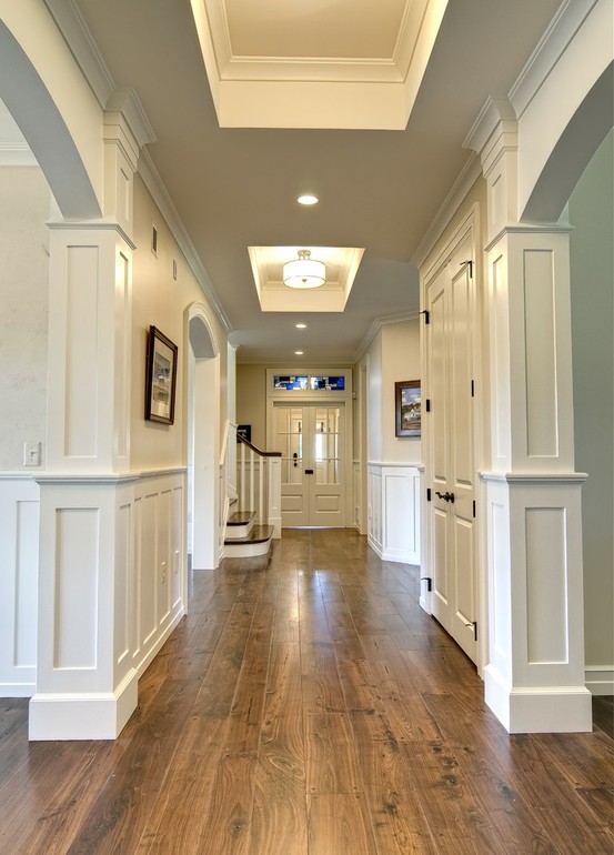
We’ll opt for a character grade, tung oil finished walnut throughout the house.  With any luck, the flooring in the living area (and throughout the house) will look something like this when we are all finished:

Character grade wide plank walnut with wood pegs and a natural finish.

Still considering 4 inch versus 5 inch wide plank.  Awaiting the final numbers! Thanks for reading.

As empty as she’ll get

2 Dec

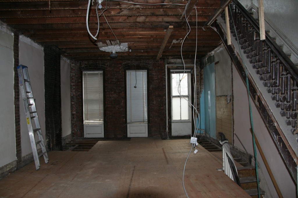
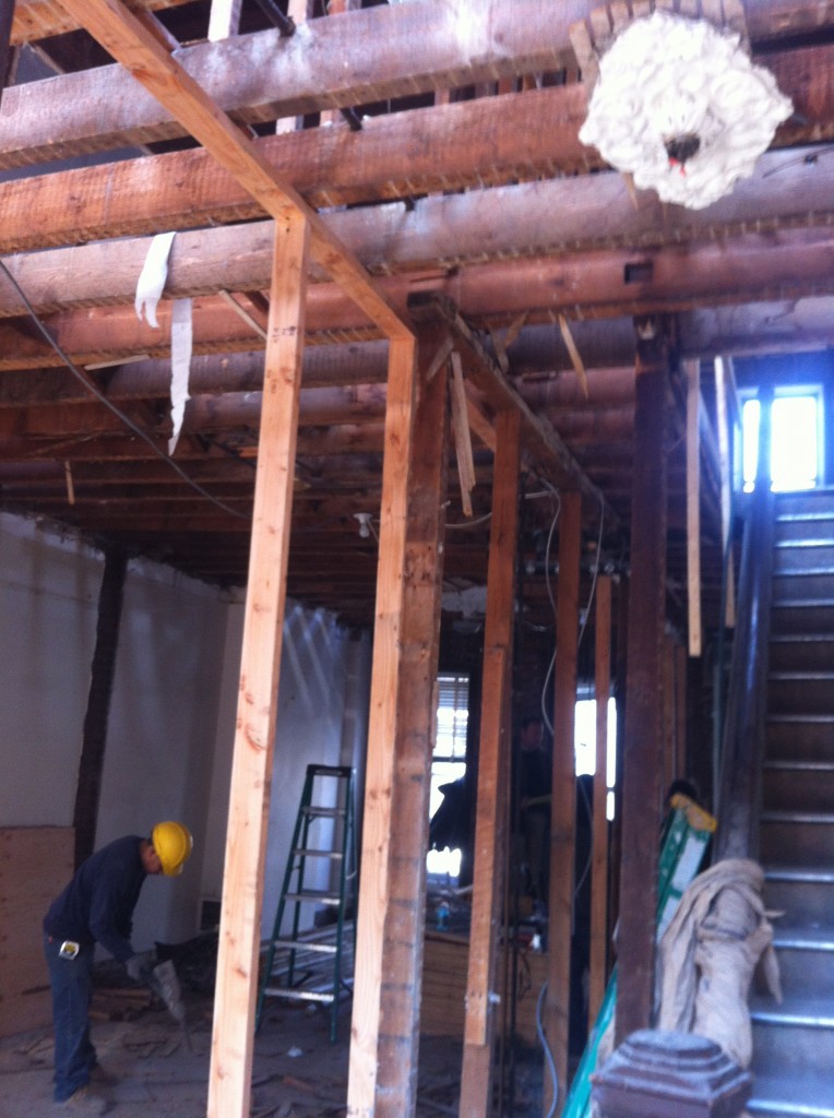
Another week passes and we are starting to turn a corner. Instead of things continually leaving the house (plaster, debris etc.), things are now starting to move in. Granted, it’s just some wood to provide temporary flooring and support but it’s nice to see something new in the house.

1st floor


Everyone’s busy schedules seemed to align, allowing us to schedule a productive meeting between the architects, structural engineer and our GC. Nothing too serious came up while they worked through a couple of decisions on supporting the new back opening and the open kitchen plan. They all agreed that things in the house look pretty good overall and were please to see some extra big support beams existing and in good condition.

Future kid bedrooms and laundry.


Last weekend also saw some decent holiday sales which allowed us to save some money on some kitchen and bath items. We were most excited about a sale on a product that we’d just seen a few days earlier in a kitchen showroom. For a long time we were going with a nice Hansgrohe kitchen faucet but that quickly paled to an amazing faucet by Waterstone that we couldn’t stop talking about. It definitely was over budget for our faucet but the 20% discount we found softened the blow. We were also able to pick up a 10% discount on a number of Grohe items that we are using around the house, plus discounts on toilets, bathtubs and other bath accessories.  More on those in future room specific posts.

Gantry faucet


Next week we hope to wrap up removal and start laying down the subfloor and framing out the rooms. Once we’ve confirmed all the measurements, we’ll be able to pull the trigger on the biggest purchase of all: the appliances. More on those in another post.